Independent project · Warmly

A digital group card that keeps the warmth, without the chasing.

Warmly is a collaborative digital greeting card where anyone with the link can add a note, photo, sticker or drawing to the same card. No accounts. No sign-ups. Just one link to pass around.

Role
Sole product designer & developer
Duration
1 month
Team
Myself
Contributions
Product strategy, UX/UI, front-end implementation
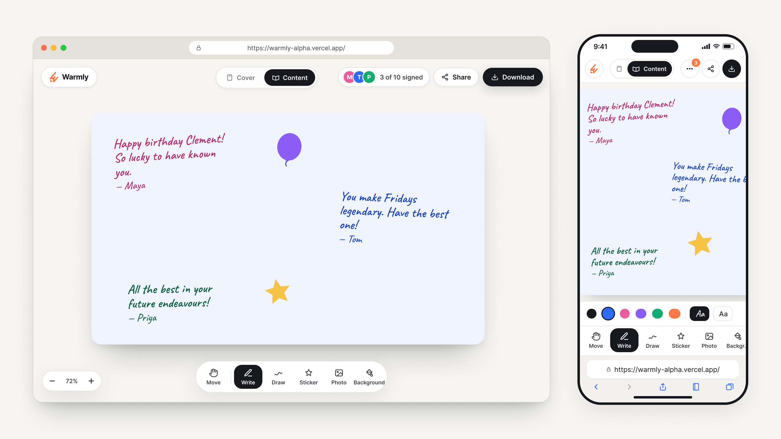
Warmly in a desktop browser and on an iPhone, showing the same birthday card with handwritten notes from Maya, Tom and Priya, a balloon and a star sticker, and the Move, Write, Draw, Sticker, Photo and Background toolbar.

I conceived, designed and built Warmly independently, from the first prototype to the working product.

Try Warmly
01The problem

I was tired of chasing people to sign a card.

The idea started with a small annoyance.

Whenever someone was leaving the office or celebrating a birthday, someone would buy a physical card and pass it around.

Then came the chasing.

Who has it?
Who hasn’t signed?
Did someone leave it on their desk?
What about people working from home?

Making the card digital seemed obvious.

But I didn’t want to digitise away the part that made physical cards nice in the first place.

The handwriting is inconsistent. Someone squeezes their message into a corner. Another person adds a ridiculous drawing. A photo ends up somewhere unexpected.

That messiness is part of the charm.

The coordination can disappear. The warmth shouldn’t.
02So I made Warmly

The experience is intentionally simple.

1. Create a card

Choose who the card is for, the occasion and the format.

2. Share a link

Warmly gives you one link.

That link is the invitation.

No account creation. No onboarding. No workspace to join.

3. Edit with friends

Anyone with the link can add:

Notes · Photos · Stickers · Drawings

Everything lives together on one shared canvas.

People can move things, resize them, rotate them and arrange the card however they like.

4. Download as PDF

When the card is done, it can be downloaded as a PDF.

It’s now live, with saved cards, photo uploads and real-time sync.

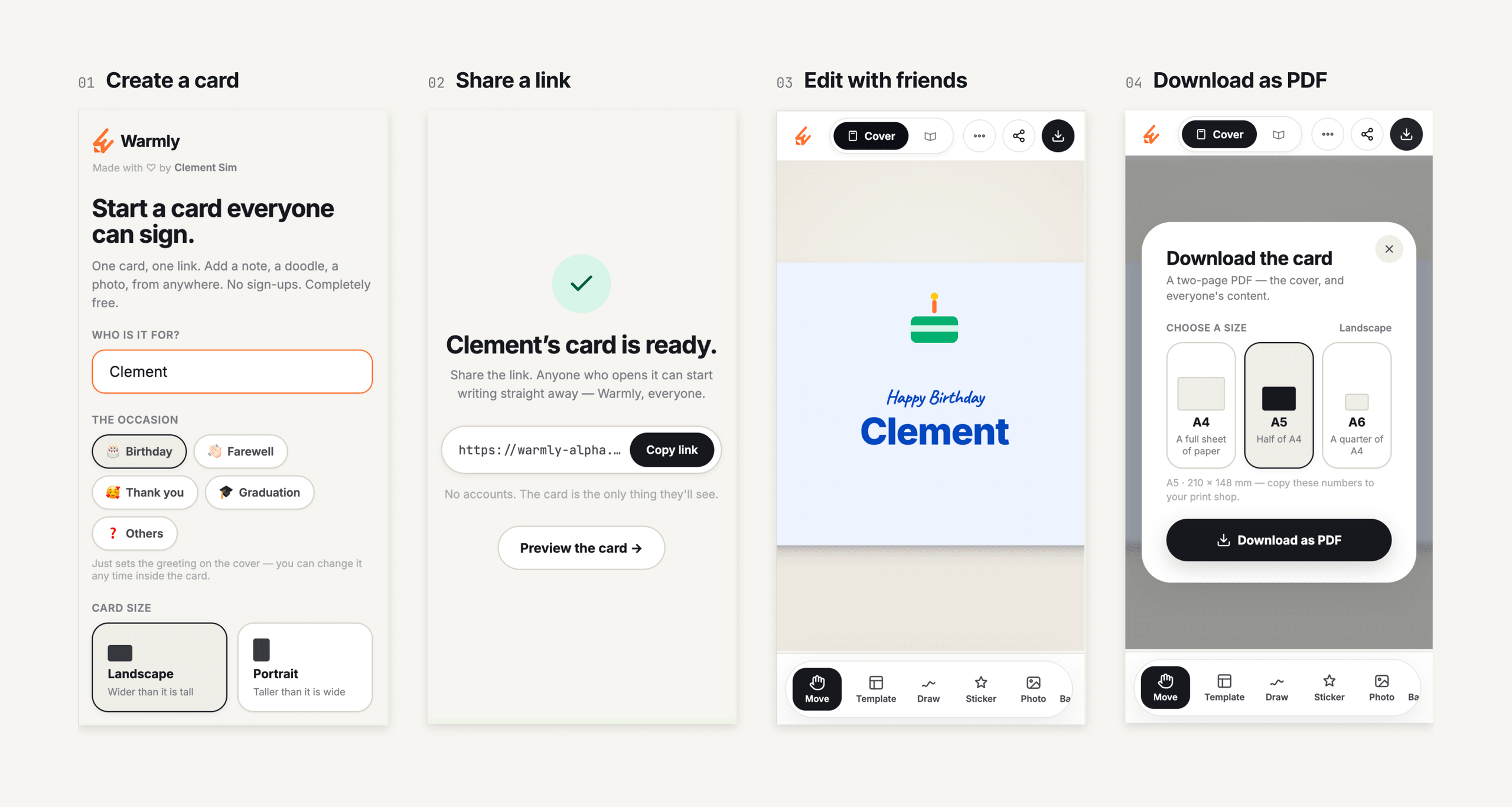
Four Warmly mobile screens in sequence. 01 Create a card: enter who it is for, pick an occasion such as Birthday, and choose landscape or portrait. 02 Share a link: Clement’s card is ready, with a Copy link button. 03 Edit with friends: the Happy Birthday Clement cover with the Move, Template, Draw, Sticker and Photo toolbar. 04 Download as PDF: choose A4, A5 or A6 and download.
Fig. 01The whole experience in four steps: create a card, share a link, edit with friends and download it as a PDF.
03Making digital feel personal

Warm and playful, but not childish or noisy.

With no brand to inherit, I had to decide what Warmly should feel like.

Warmly needed personality, but I didn’t want the interface itself to become overly cute.

Most of the expression should come from the card people create, not from decorative UI surrounding it.

The card canvas can become colourful and chaotic. The interface around it stays relatively restrained.

Over time, I deliberately pulled the brand orange back and reserved it for only a few moments, while primary actions became near-black and selection states became more neutral.

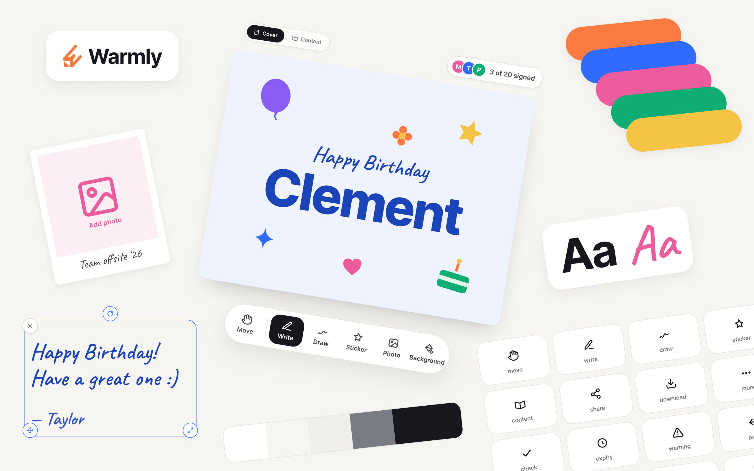
Warmly’s visual kit: the logo and wordmark, a birthday card cover reading Happy Birthday Clement with stickers, a polaroid photo frame, a selected handwritten note with its handles, the pill toolbar, the cover and content toggle, the signed counter, the five ink colours, a neutral grey scale, sans and handwritten type samples, and line icons.
Fig. 02Warmly’s visual kit. The interface stays restrained so the card itself can be expressive.

A card, not collaboration software.

I deliberately avoided the patterns that make collaborative products feel heavy.

No accounts.
No complex permissions.
No app to download.

If you have the link, you can join the card.

Instead, your browser remembers which notes are yours.

04Designing a canvas for fingers too

A card you touch, not a page you fill in.

People drag, draw, resize, rotate, pinch and type.

That meant mobile could not simply be a smaller version of desktop.

The mobile experience eventually gained its own top and bottom controls, simplified menus and pinch-based zoom rather than trying to squeeze the desktop interface onto a phone.

I also removed an auto-zoom interaction I had spent a long time refining. It looked good in isolation, but on an iPhone the keyboard and the suggestion bar above it covered the note being typed.

Every phone’s keyboard behaves differently, so there was no zoom level I could rely on. Removing it was the simpler, more reliable choice.
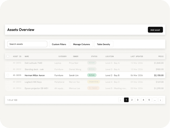
Selection controls also had to remain usable while the canvas zoomed.

Instead of shrinking and growing with the card, the manipulation handles were designed to stay roughly the same size on screen.

Fig. 03Selection handles stay the same size on screen as the card zooms.
The question stopped being
How do I fit the desktop UI here?
and became
What interaction still makes sense when someone’s fingers become the cursor?
05Real-time

Everyone needed to see the same card.

A shared card only feels shared if everyone is looking at the same thing.

When one person added, moved or deleted something, the change appeared on everyone else’s screen straight away.

Without that, two people could end up editing something that was no longer there.

Fig. 04A deletion in one browser appears in the other straight away.
06Feedback

People liked it. Then they asked for more control.

Once Warmly was live, I asked five friends to try it.

The feedback was mostly positive, but two requests stood out.

Request 01
“Let me edit other people’s notes.”
What I decided

You can only edit what you wrote.

With no accounts, letting anyone edit anything would mean anyone could remove someone else’s message. A card only works if people trust that what they wrote stays theirs.

Request 02
“More shapes, more colours, more fonts.”
What I’m keeping in mind

I haven’t added these yet.

They are reasonable requests, but each one makes the canvas noisier and the toolbar heavier. Anything I add next will need to earn its place.

07One thing I learned

Simplicity doesn’t stay simple by itself.

As Warmly became more capable, the harder design problem wasn’t adding features.

It was keeping the product feeling simple.

Every new tool pulled it a little closer to becoming another Photoshop, with more buttons, more menus and more to learn. But a card for a birthday or a farewell shouldn’t feel intimidating to make.

Simplicity doesn’t protect itself. It has to be defended, one feature at a time.

Warmly started as a small response to an annoying office ritual.

It taught me something broader:

People should notice the card, not the technology behind it.
More work