Designing Better Enterprise Tables
A UX research study exploring how complex enterprise tables can better support users in finding, comparing and managing information.
- Role
- UX Design Intern
- Duration
- 2+ months
- Team
- Myself, with guidance from a senior UX designer
- Contributions
- Research synthesis, interaction guidelines, decision framework
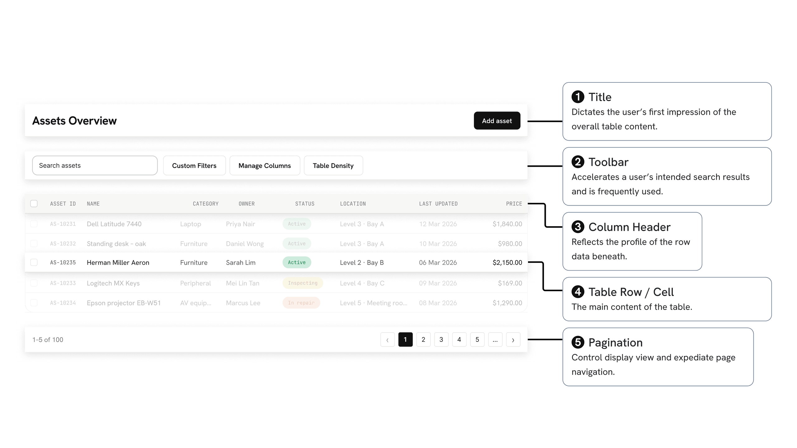
Tables look simple until they need to work at scale
Tables were widely used across the enterprise products I was working on during my internship.
At first glance, designing a table may appear straightforward. But as more data and business requirements are introduced, a single table may need to support filtering, sorting, dense datasets, editing, batch actions, nested information and different user workflows.
There was also no single table pattern that worked for every situation. Different users, datasets and business requirements could lead to very different design decisions.
The challenge therefore became less about finding the “best” table design and more about understanding:
Knowing the patterns was not enough. I needed to understand when to use them.
As I studied the different ways people interact with tables, I found that most scenarios could broadly be organised around two objectives.
Quickly reach the information you need.
Efficiently act on and maintain information.
As the research grew, so did the number of possible solutions.
A filter alone could take several forms. Additional information could be shown inline, inside a drawer, in a dialog or on another page. Actions could remain visible, appear on hover or be grouped inside an overflow menu.
Rather than treating these patterns as isolated UI components, I began connecting them back to the questions a designer should ask before choosing one.
This eventually became a decision map.
Table Pattern Navigator
Start with what the user needs to accomplish, then follow the questions to explore some of the considerations that can help narrow the design direction.
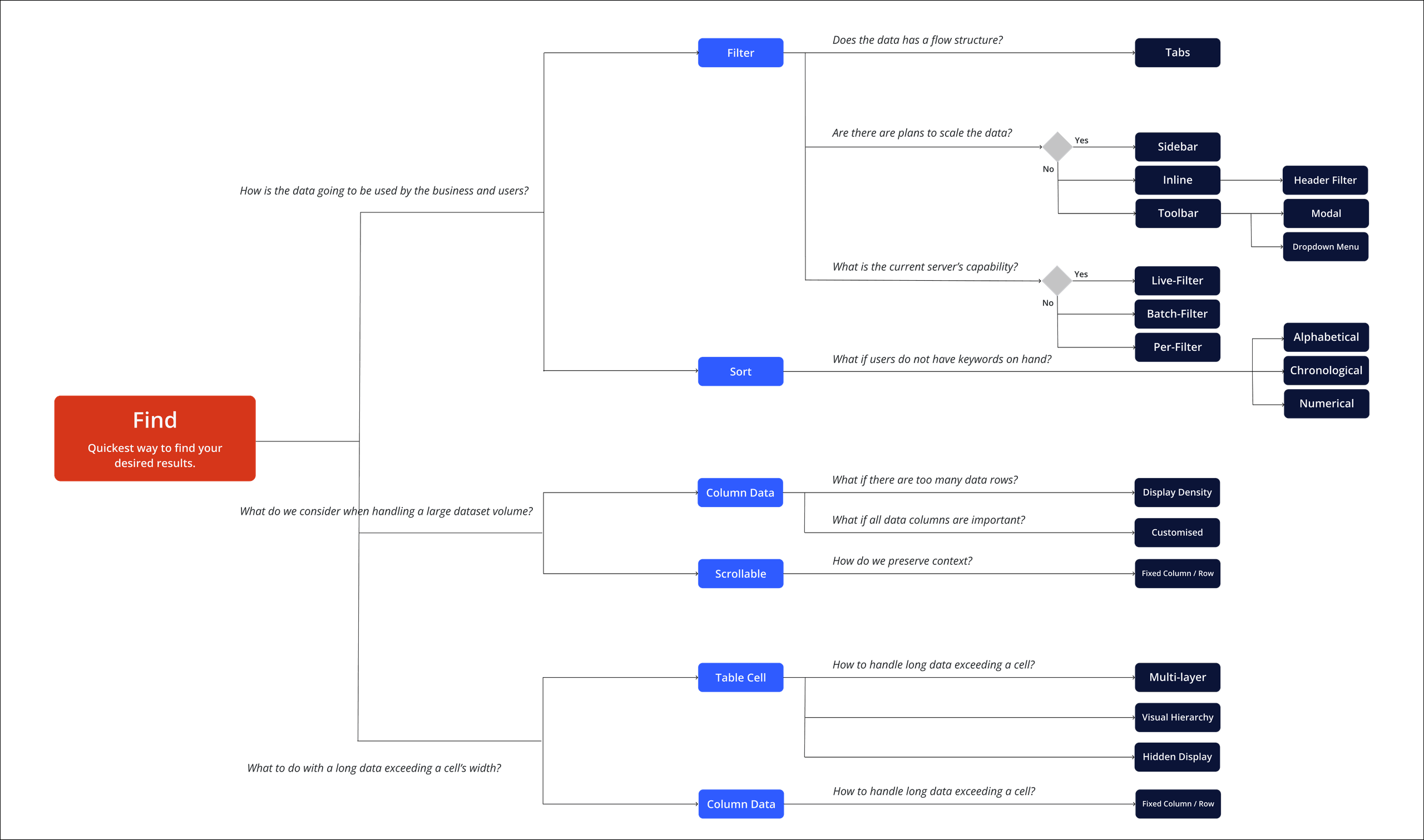
How might we help users find what they need without overwhelming them with controls or data?
One of the primary purposes of an enterprise table is helping users locate and compare information efficiently.
Through the research, I found that the appropriate interaction often depended on the structure of the dataset, the amount of information being handled and how much processing the system needed to perform.
Different datasets require different ways of helping users reach the information they need.
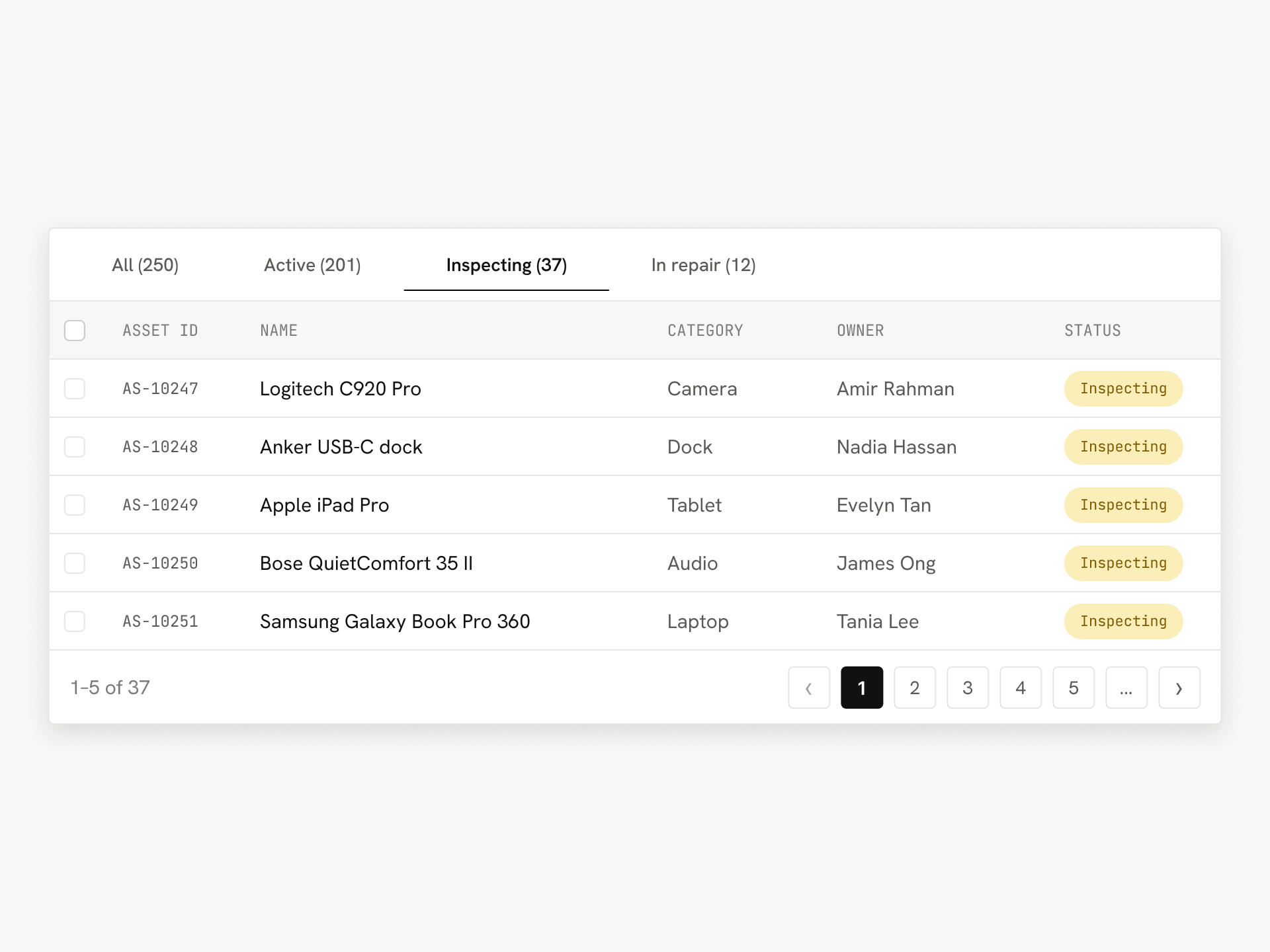
Tabs
Tabs can work well when information follows a clear and progressive logical flow.
For example: Draft → Pending Review → Approved
They can also help users understand aggregated values across clearly defined categories.
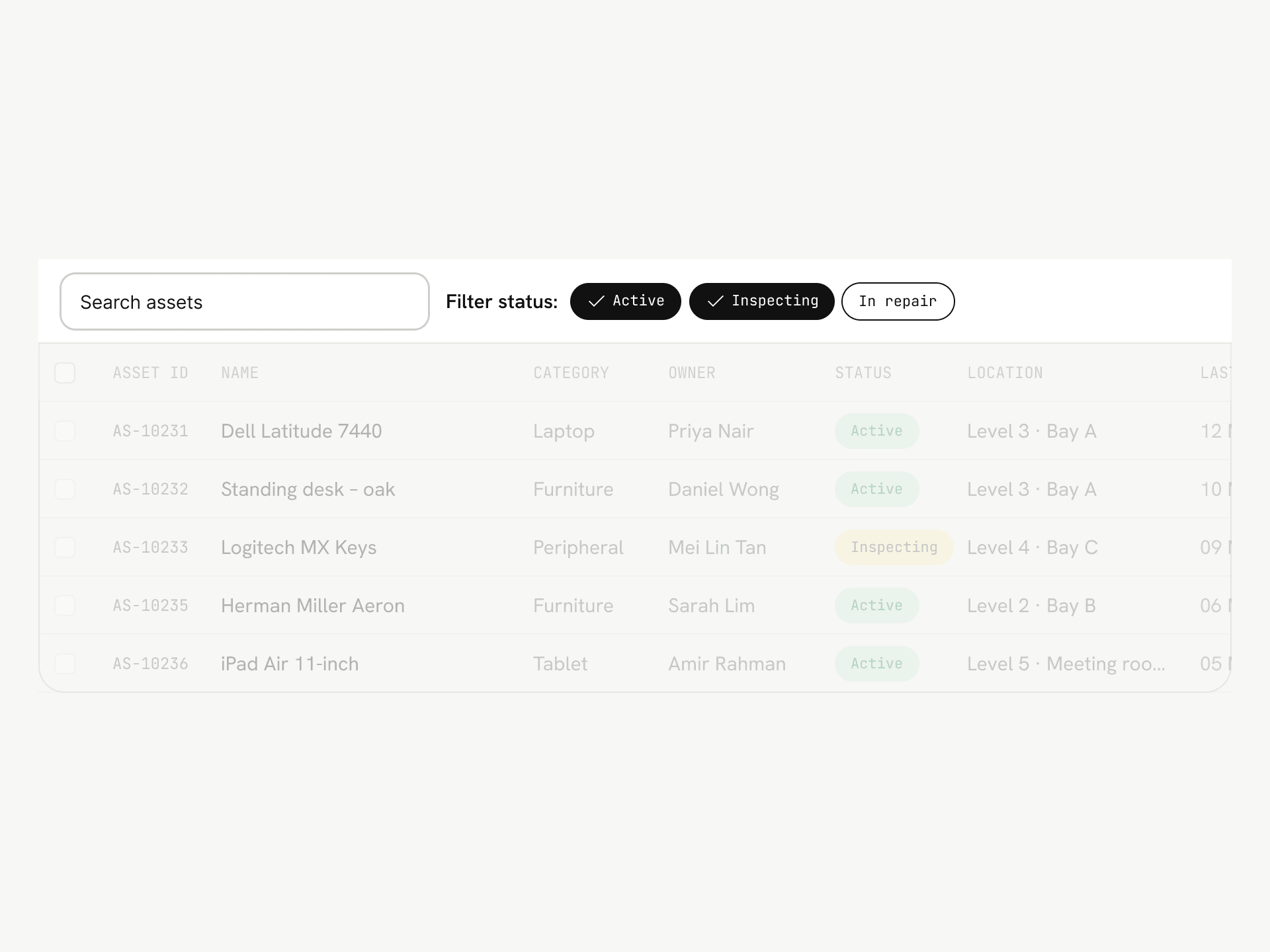
Live filtering
For smaller datasets or lightweight interactions, results can update immediately when users change a filter.
This provides quick feedback and reduces the number of actions required.
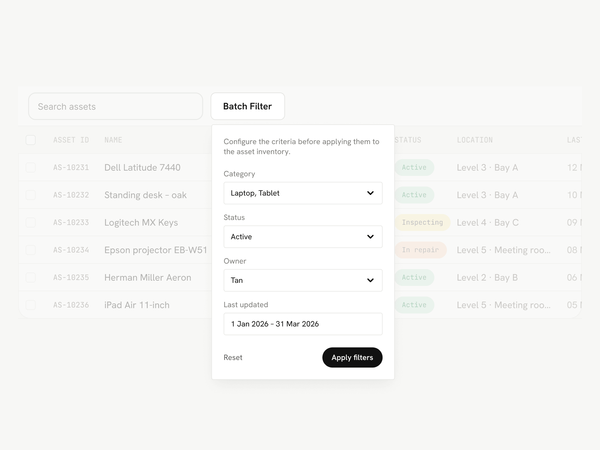
Batch filtering
For larger datasets, complicated filters or systems where queries are expensive, it may be better for users to configure several criteria before applying them together.
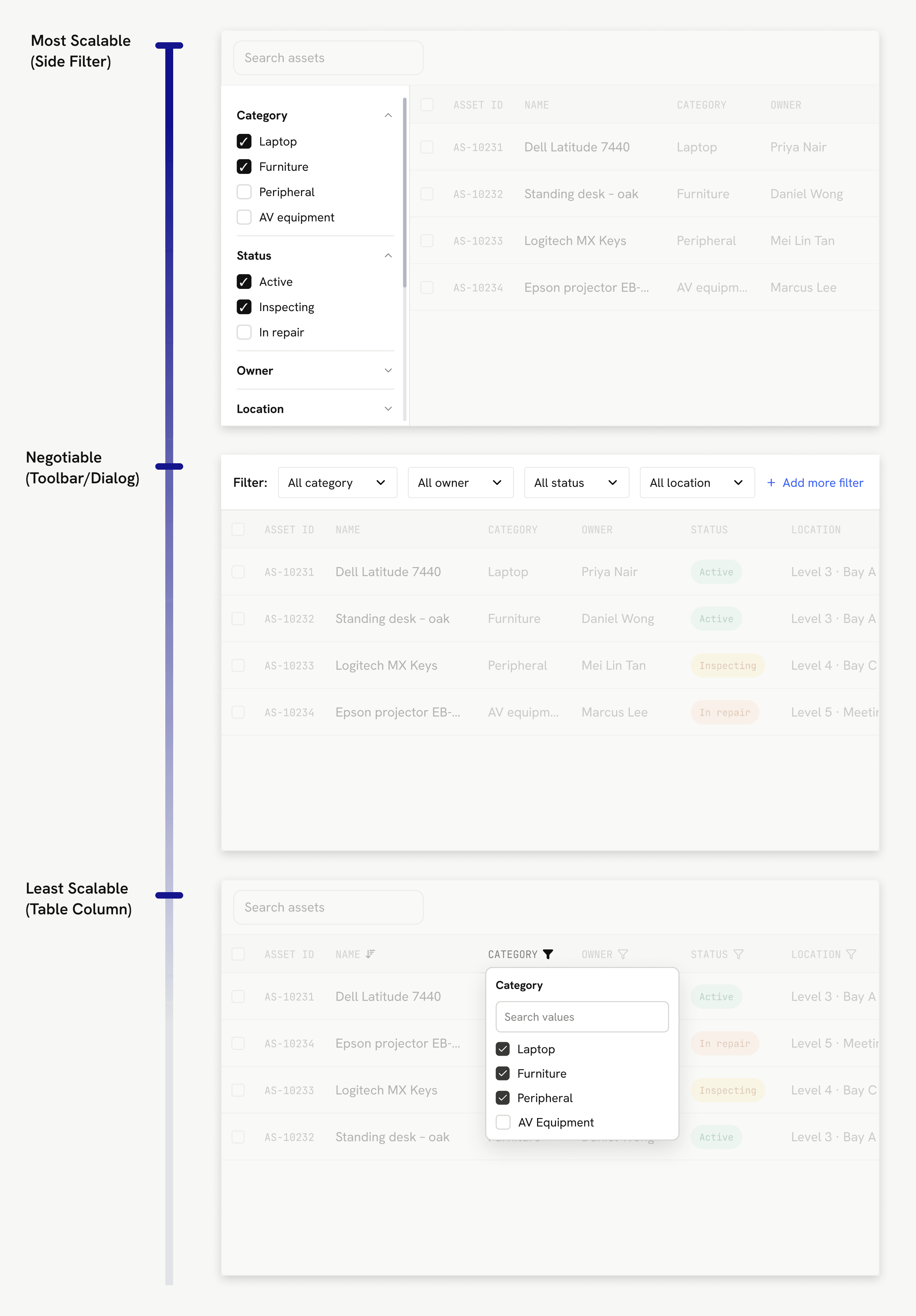
Designing for scalability
The number of filters may increase as a product grows.
A sidebar or drawer can accommodate additional criteria through expandable sections, while inline and header-based filters can become more difficult to manage when the number of options increases.
More information does not always mean showing more information.
Enterprise tables may contain hundreds of records and many fields considered important by the business.
Instead of simply adding more rows and columns, I explored ways of giving users greater control over density.
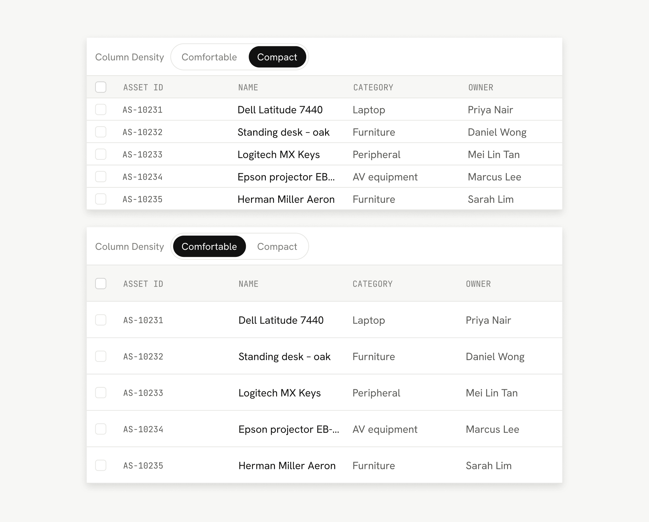
Display density
Allowing users to adjust row height provides control over how much information can be seen at once.
A denser layout can help users scan more records efficiently, while a more spacious layout may improve readability.
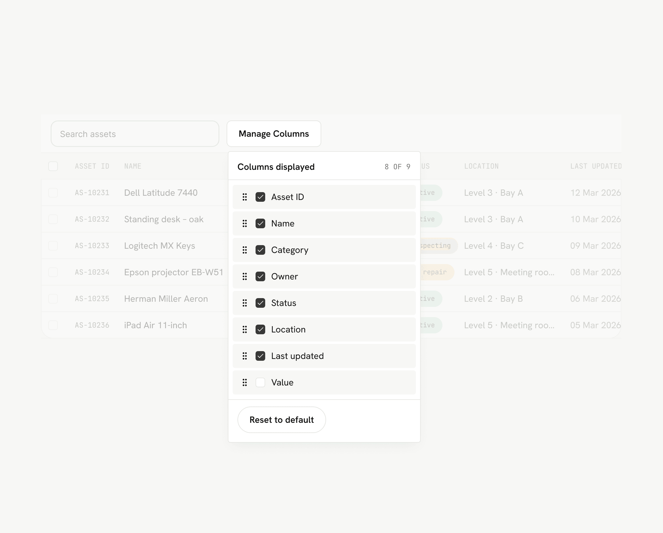
Column customisation
When many fields are important, displaying everything simultaneously may not be practical.
Allowing users to add, remove or reorder columns lets them prioritise the information most relevant to their workflow.
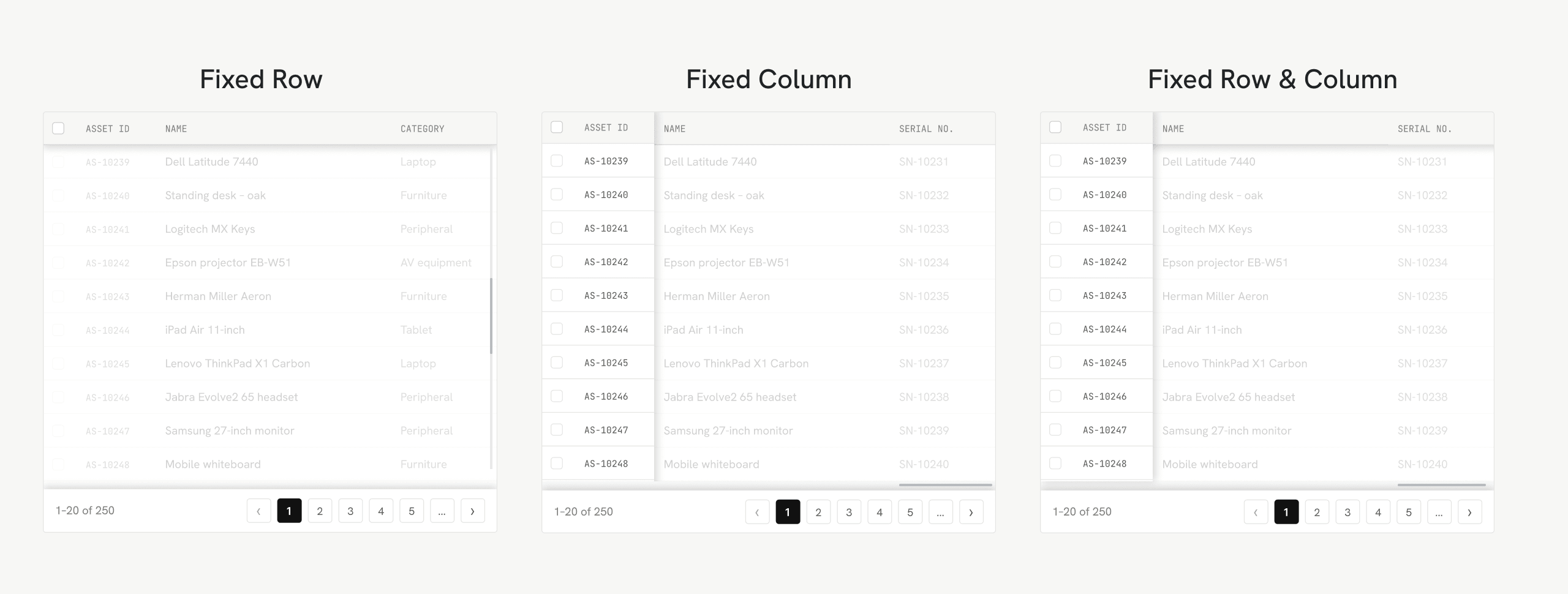
Preserve context
Large tables also introduce another problem: users can lose track of what the information represents while scrolling.
Fixing headers during vertical scrolling keeps column labels visible.
Fixing identifying columns during horizontal scrolling helps users retain the context of each record.
Not every piece of information deserves another column.
Some table fields may contain significantly more information than the available cell width can comfortably display.
Rather than automatically expanding the table, I explored different levels of information disclosure.
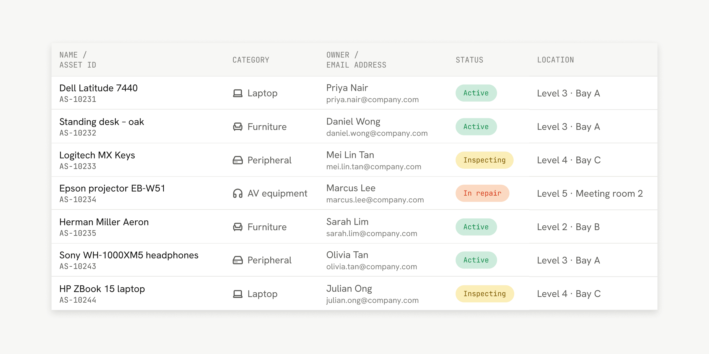
Compress
Information can sometimes be condensed using multiple lines, visual hierarchy, labels, tags, icons or symbols.
This allows useful context to remain visible without allowing individual fields to dominate the table.
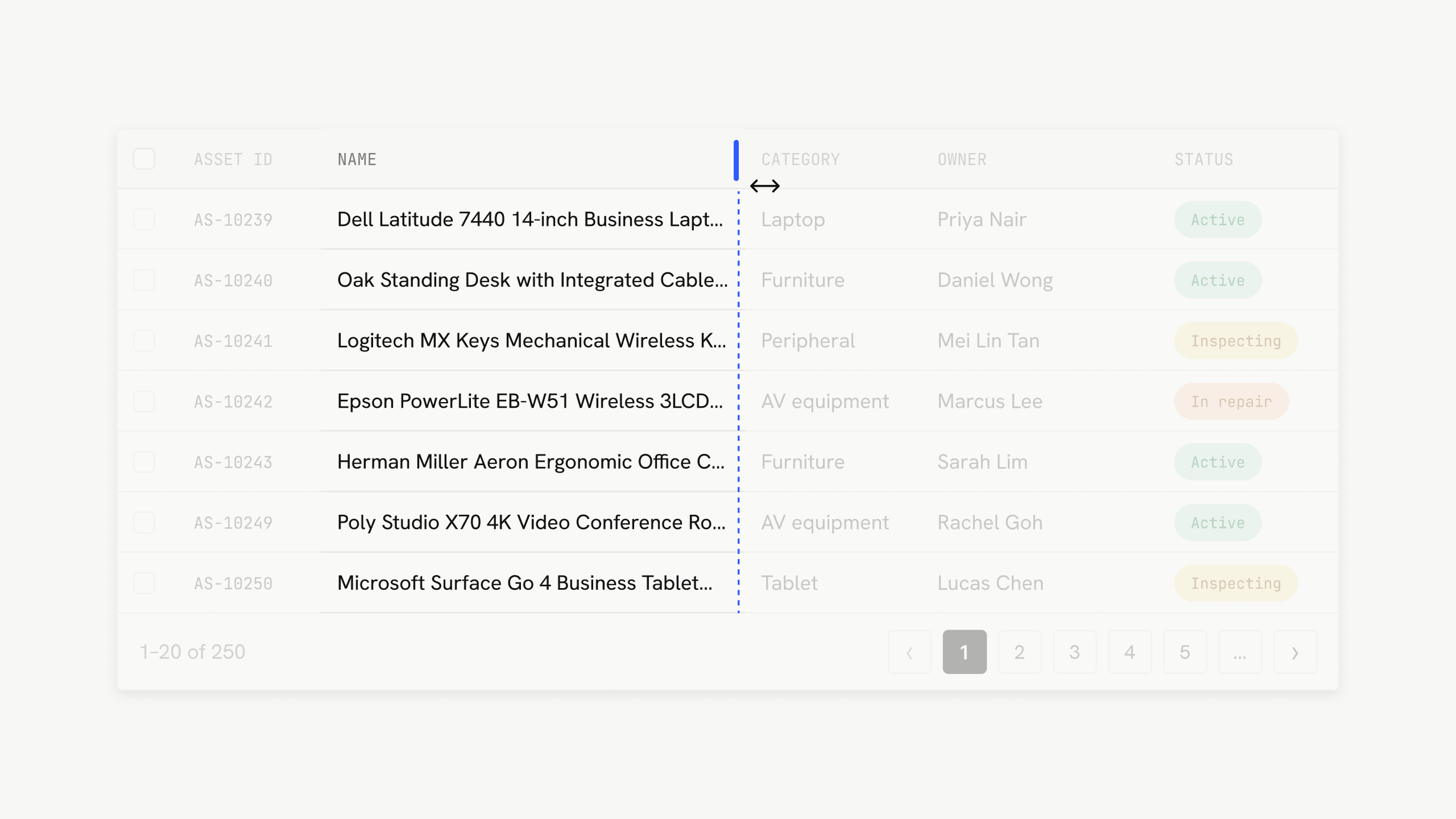
Resizable columns
Resizable columns can allow users to temporarily expand abbreviated information.
However, this also introduces additional layout and implementation complexity.
Tables are not only for reading. They are also workspaces.
In many enterprise systems, users need to act directly on the information contained inside the table.
This introduced a different set of considerations around actions, editing and complicated workflows.
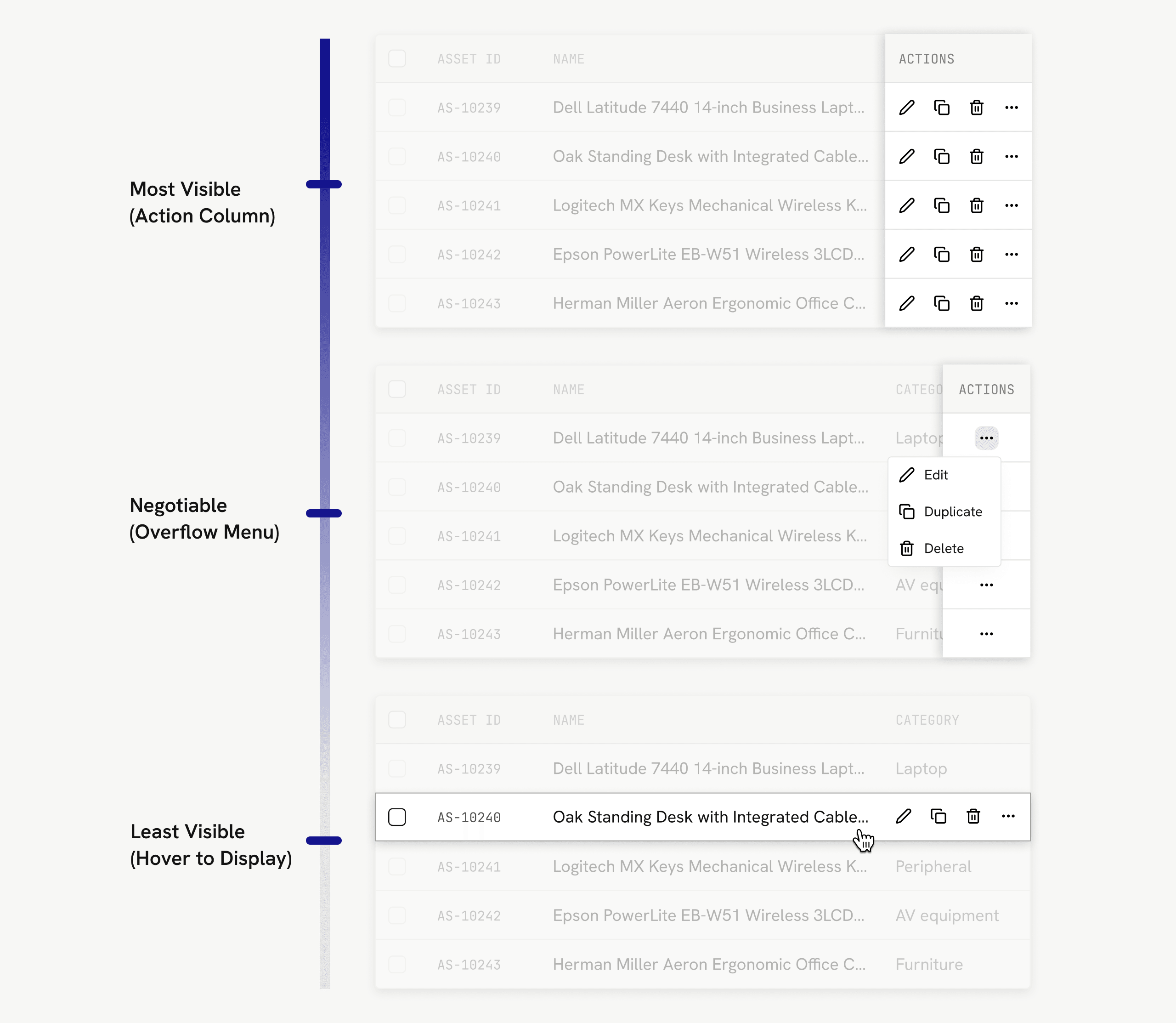
Keep frequent actions visible. Hide complexity carefully.
Displaying every possible action can increase discoverability, but quickly creates visual clutter.
The research therefore treated action visibility as a spectrum.
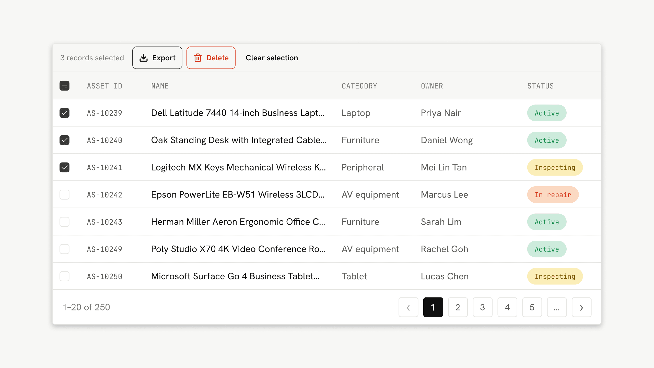
Batch actions
When the same operation must be repeated across several records, selecting multiple rows and performing a single batch action can significantly reduce repetitive work.
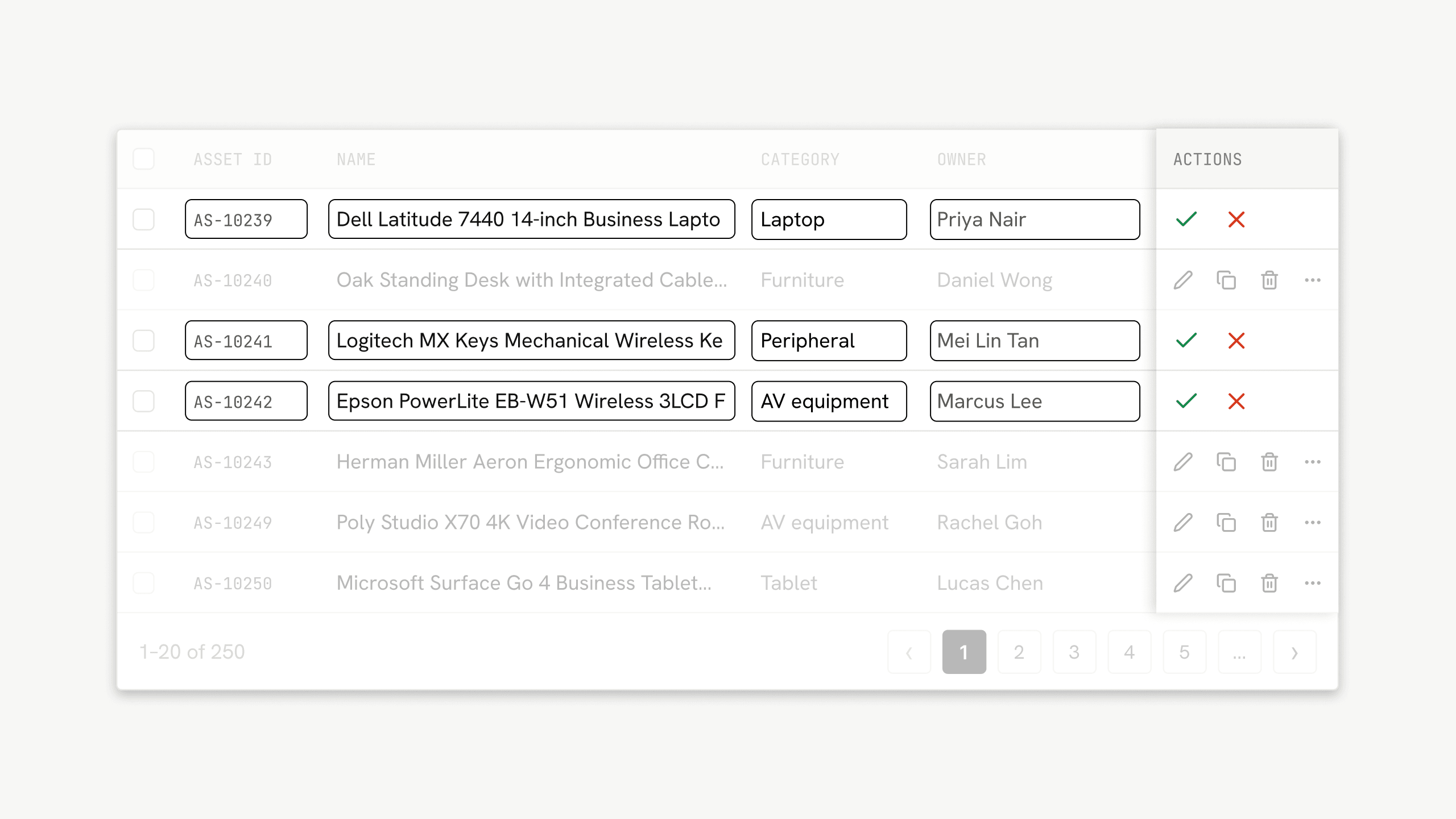
Inline editing works best when the task is small.
Inline editing allows users to change information without navigating away from the table.
It can be particularly useful for frequent, lightweight changes such as:
However, it also introduces trade-offs.
Making editing permanently visible can clutter the table.
Revealing editing only on hover can make the functionality easier to miss.
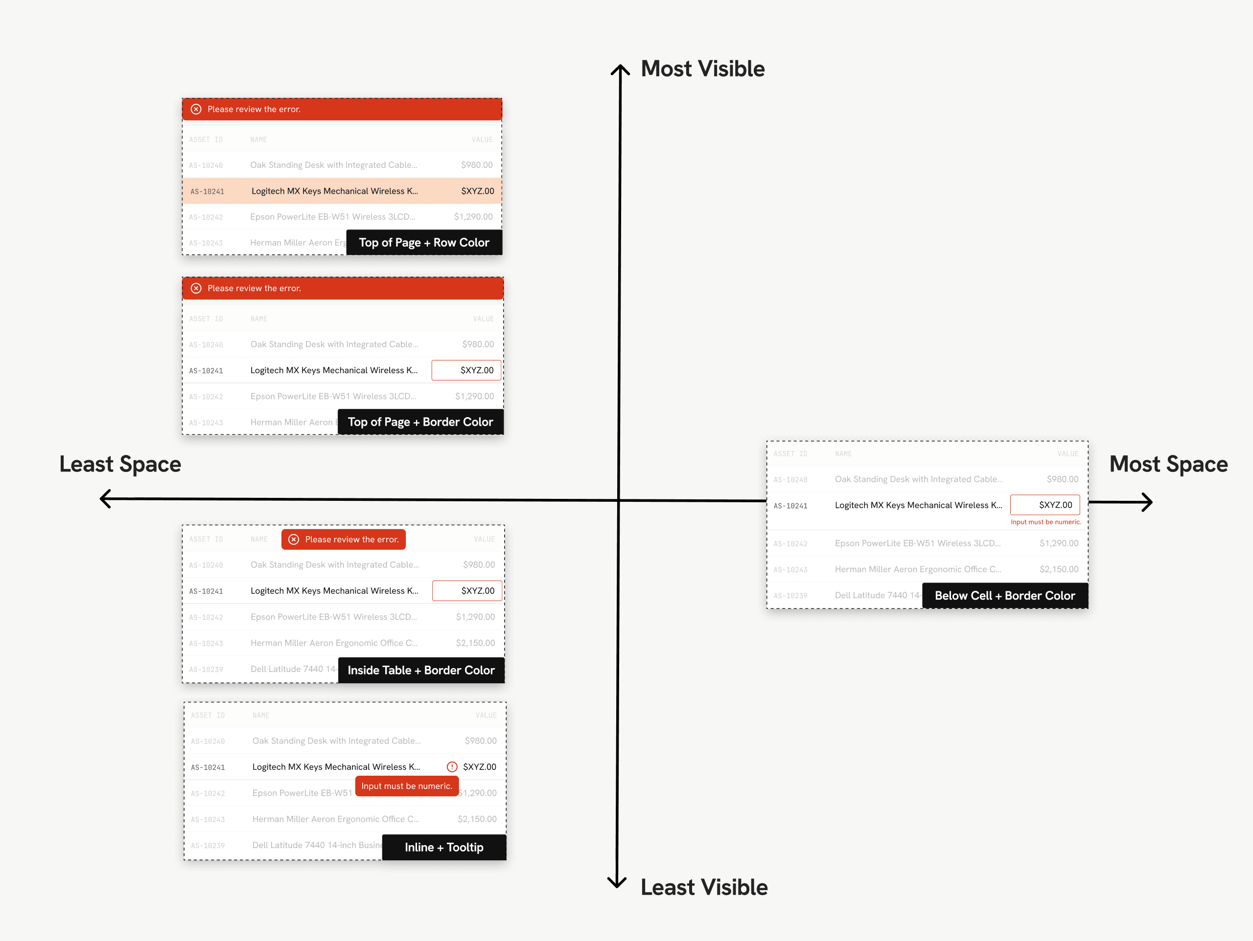
Validation also needs to clearly communicate where an error occurred without overwhelming the rest of the interface.
The more complex the task, the more space it should receive.
One recurring question throughout the research was where additional information or interactions should live.
Rather than treating every secondary surface as interchangeable, I considered them according to the amount and complexity of information they needed to support.
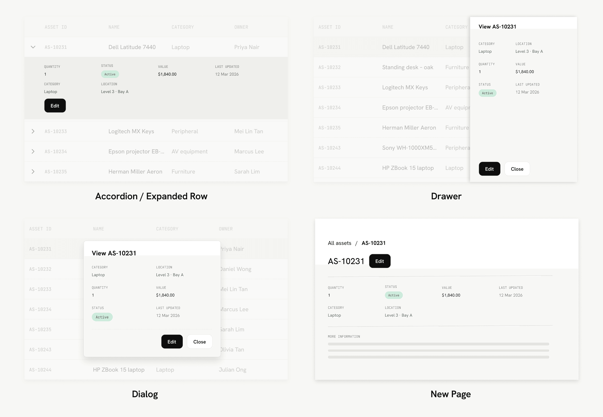
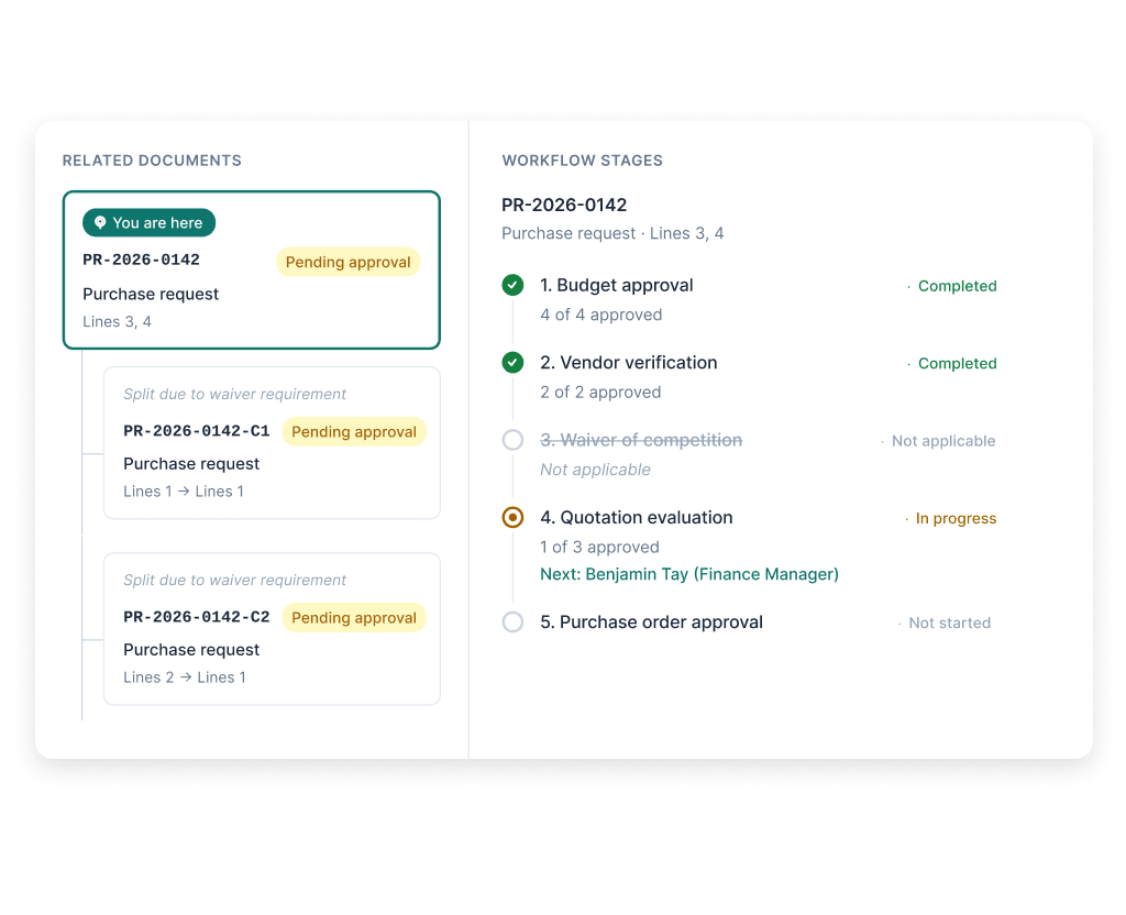
Useful for a relatively small amount of related information while keeping users inside the table.
The trade-off is increased interaction cost when users need to inspect multiple rows.
Provides more space for secondary information while retaining some context of the original table.
It can support more information than an expanded row, although it may introduce visual clutter.
Useful for short, focused interactions requiring temporary attention.
Less suitable when users need substantial supporting information or need to continuously refer back to the table.
When a task involves significant information, multiple steps or complex decision-making, forcing it to remain inside the table can create unnecessary constraints.
A dedicated page gives the workflow more space and allows users to focus.
Interaction patterns should solve a problem, not exist simply because they are interactive.
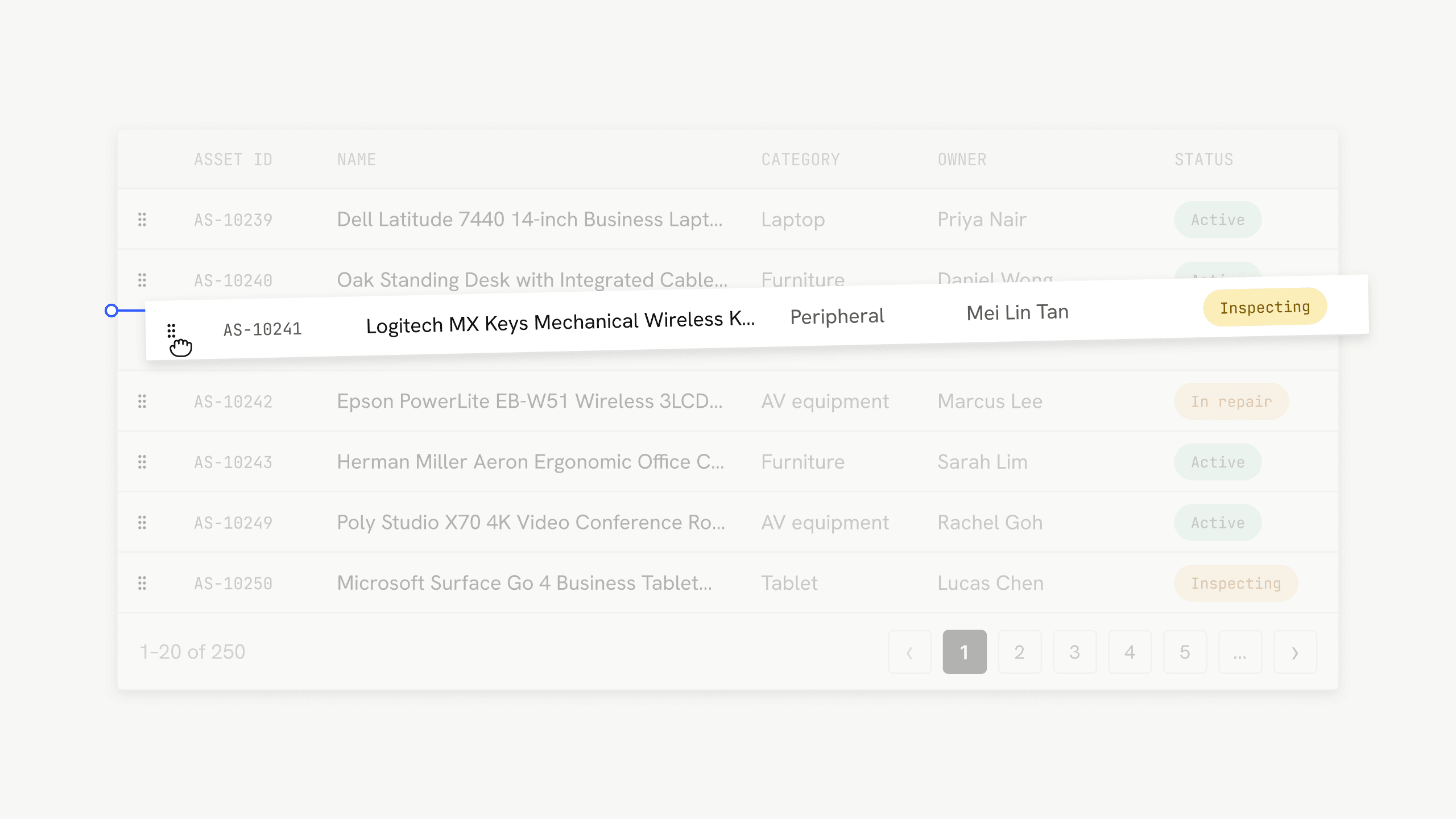
I also explored drag and drop as a method for reordering and manipulating information.
Drag and drop can be useful when users already expect direct manipulation or when there is no simpler interaction that achieves the same result.
Clear feedback is particularly important. This may include:
Good table design is ultimately contextual.
This project taught me that enterprise UX is often less about inventing new interaction patterns and more about choosing the right trade-offs.
Tables become complex because they sit at the intersection of user needs, data structures, business requirements and technical constraints.
The most useful outcome of the research was therefore not a single recommended table design, but a clearer way to evaluate which interaction patterns were appropriate for different situations.